

Graphic Design
I'm beginning to optimise some of the PDFs - so here's some of the design for print work I've done. Please bear in mind that because these are web-optimised PDFs some image quality may be lost and, as they've been converted to RGB colour profile from CMYK the colours may appear a little bland - the actual printed versions look much better.
You will need Adobe Acrobat Reader to view the PDFs.
Examples
Danish Advert
This advert is about to be published in a Danish magazine and I just had an email today from the colleague responsible for Danish advertising saying that the magazine liked the advert so much they upgraded it from the position it was in (inside the mag) to the back page for free; they thought it would "increase the perceived value of the magazine". That brightened up my whole afternoon!
OK, granted the magazine may have been having problems filling that more expensive back-page area but even so, they could have given a discounted rate or placed any of the other full-page ads they were running there rather than giving us a free upgrade.
In case you're not aware, advertising space in magazines is graded by prominence - covers (inside and out) are the best spots as that's where the ads are most visible and so they're the most expensive areas to place adverts.

12 Page Mailer
This is a 12 page mailer, about A5 sized, that went out as insert with another mail-order company. The idea being to introduce potential new customers to CJs and give them a chance to buy from a selection of best-sellers and gift-oriented items without overwhelming them with the full range of products. Not that it would have been practical to include the full range in a parcel dispatch flyer of course.

Show Postcard
This is a design which was doing the Summer shows in 2007; first at the Chelsea flower show. It is just a small postcard format flyer with all the various CJ/Vivara web addresses on the back so that visitors to the stand can take it away and order online later, should they wish to do so.

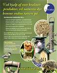
Dutch Advert/Flyer
I'm not entirely sure what this was used for - it was either a flyer or an advert designed for Vivara (yes, they supplied the text) to accompany Birdfair (Netherlands I think, possibly Belgium). Personally I prefered an earlier version with the blue Vivara logo, outlined in white, but they wanted the green and as it was their material it was their call really.

